A locally based project
Matkovin.fo supports a sustainable, locally based economy in the Faroe Islands. Therefore, we prioritise buying services from companies and individuals based in the Faroe Islands.
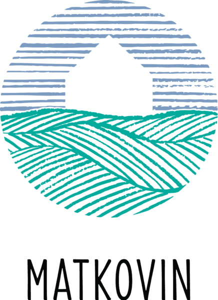
The logo
The logo is designed by Faroese artist, Jón Sonni Jensen, He shares some words about the logo:
“I chose to make a round shape that refers to the sustainable cycle: producer – product – consumer. The circle consists of three elements: The air, a house and the sea/terrain.
The upper half refers to the air. A surface with horizontal lines gives calmness to the image. It is contrary to the dynamics in the lower part. The grey-blue colour represents the Faroese air and our changeable Nordic climate .
In the centre, we see the outline of a house. The house can be a barn, a boathouse or a company, but it can also be the home of the consumer.
The lower half refers to the terrain or the sea. There are blue-green dynamic lines, and their directions create depth and a three-dimensional impression. The lines are blue-green and they lie in the middle between our green allusions to the terrain and our blue thoughts about the sea. “
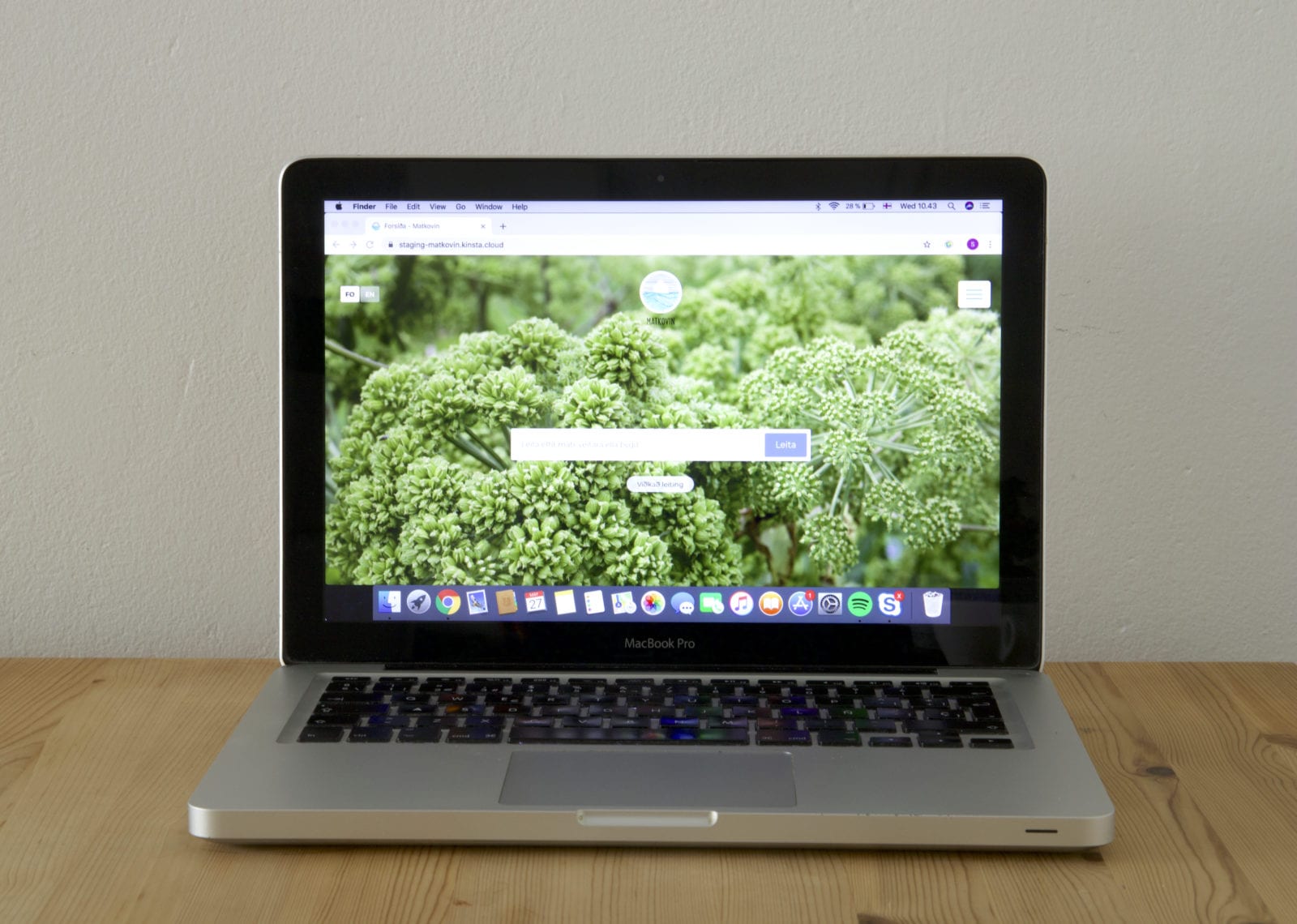
The website
The website is developed by the company, Sp/f Beak, from Toftum.
As requested by Matkovin, Beak has developed a search engine that informs about the location of the Faroese producers and their products.
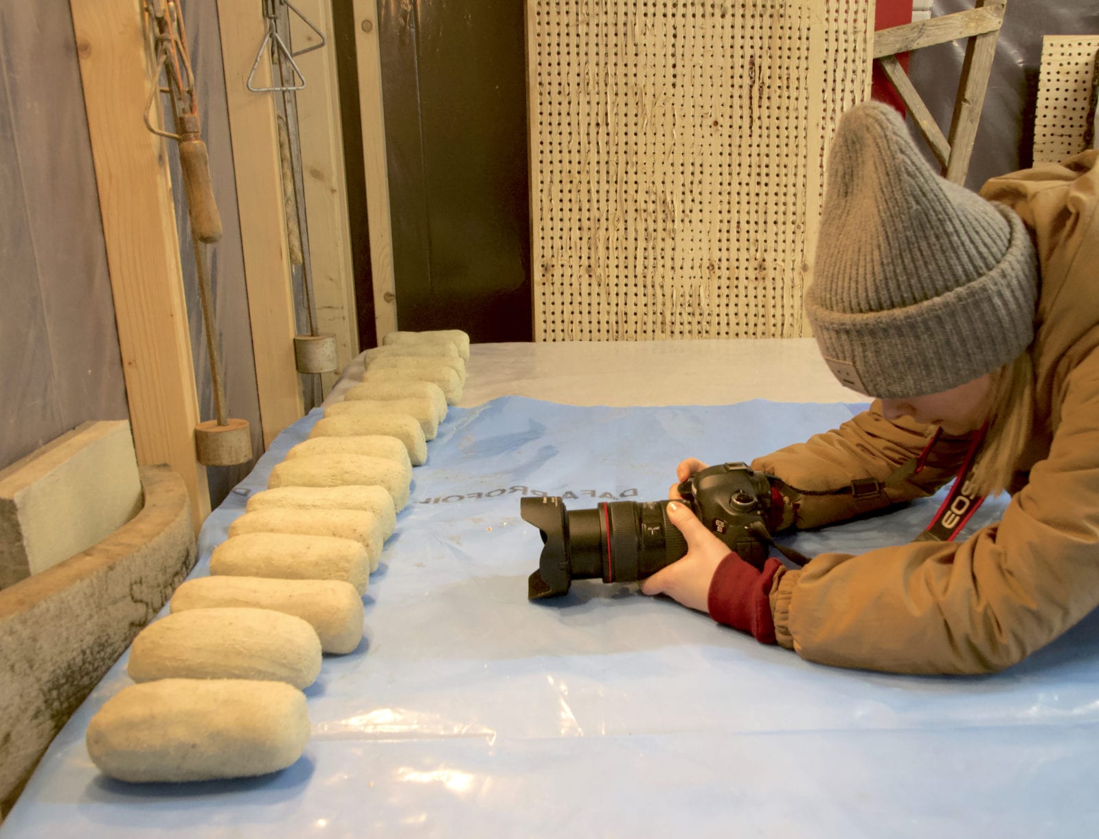
Photography
Many of the photos featured on the website are taken by local photographer Súsanna Smith Johansen.
Súsanna has a bachelor and master degree in fashion photography, and she has extensive experience with business, portrait and wedding photography.